Creative Directing
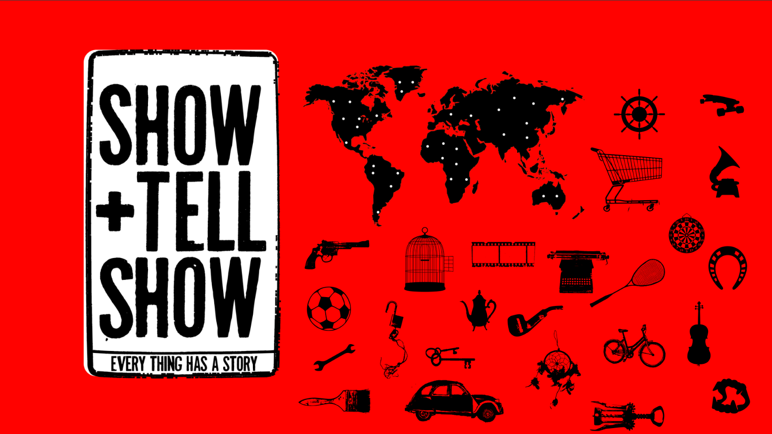
The Show+Tell Show is an online archive of Show+Tell videos made by people from all over the world. Part of the challenge when conceptualizing the branding was that it had to convey the purpose of the project. The look was based on the idea that we are surrounded by a world of strange and fascinating objects and every one of them can be interesting and unique. We based the look around the slogan "Every Thing Has A Story", and designed a wallpaper where all the objects are featured in the background. The elements used were weathered and mundane but possessed a nostalgic and almost archival feel. By presenting this arrangement we were able to visually convey the idea of multitude and playfulness that wouldn't compete with the logo or the videos once they were layered on top. The logo was made with a stamp-like font reminiscent of an old printing press. Once again reinforcing that idea of the object as an element of curiosity which combined with the graphic background relayed the project's purpose of collecting stories.
The Show+Tell Show is an online archive of Show+Tell videos made by people from all over the world. Part of the challenge when conceptualizing the branding was that it had to convey the purpose of the project. The look was based on the idea that we are surrounded by a world of strange and fascinating objects and every one of them can be interesting and unique. We based the look around the slogan "Every Thing Has A Story", and designed a wallpaper where all the objects are featured in the background. The elements used were weathered and mundane but possessed a nostalgic and almost archival feel. By presenting this arrangement we were able to visually convey the idea of multitude and playfulness that wouldn't compete with the logo or the videos once they were layered on top. The logo was made with a stamp-like font reminiscent of an old printing press. Once again reinforcing that idea of the object as an element of curiosity which combined with the graphic background relayed the project's purpose of collecting stories.

Simple black text over white forms the logo and holds the project motto "Every Thing has a Story". Background with multitude of objects re-enforces the concept while adding a nostalgic and mysterious.
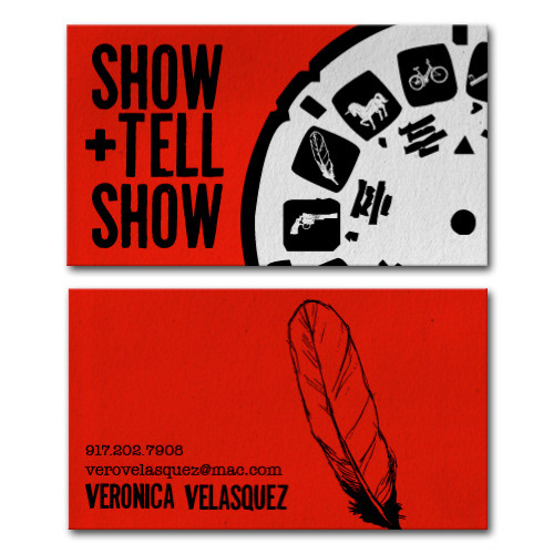
With the business cards we decided to give each person a different object next to their name in order to further personalize the cards.
SCREEN CAPTURES
The visual language of the video was very brand specific everything was made of silhouettes that moved about the screen explaining the different concepts.
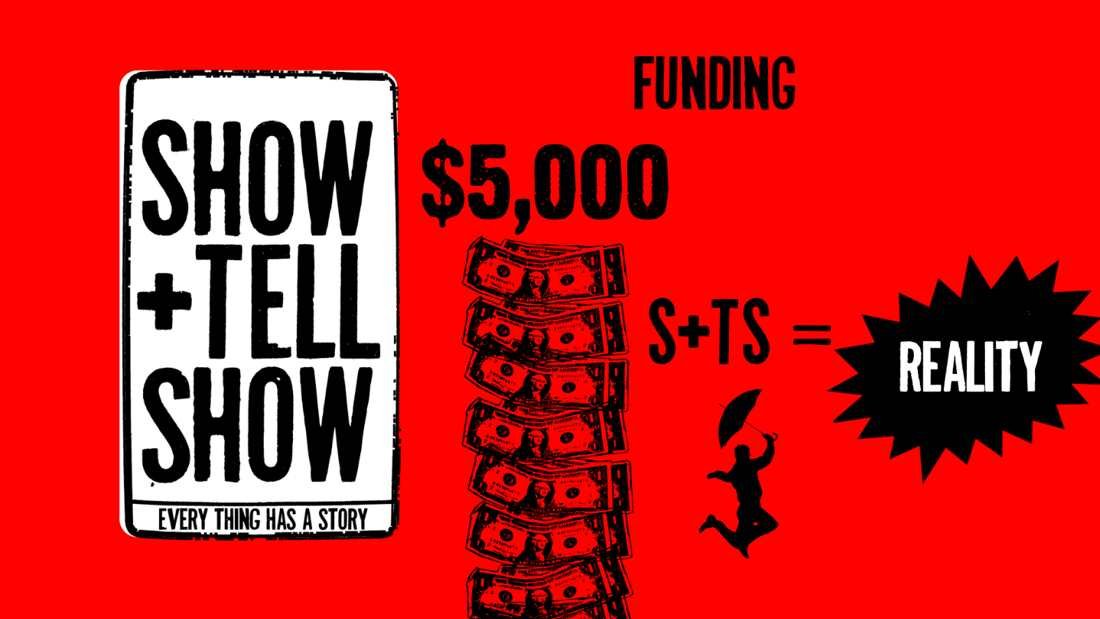
One if the issues faces was the lengthiness of the name "The Show+Tell Show" especially when incorporating it into social media and having people reference it online. The short hand version of the projects name "S+TS" became an key visual element as well as helped generate a simple language that was familiar to the public participating.
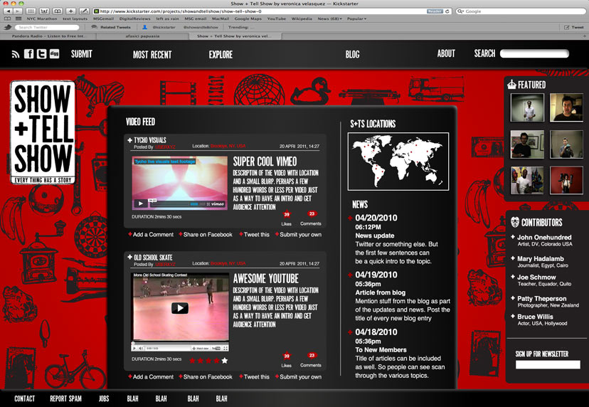
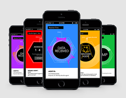
When designing the website it was clear that navigation was crucial to creating the culture of the project. people needed to be able to interact with each other see a feed of videos, share and comment on the ones they liked as well as post content of their own. The site had to be transparent and easy to use yet capable of growing and evolving with it's public. It became clear that the options had to be available at first glance. this is where we developed the idea of containers and icons. Every section was fit inside a container and given an icon to represented so even when you were in other pages you could preview or access other sections by just clicking on the icons
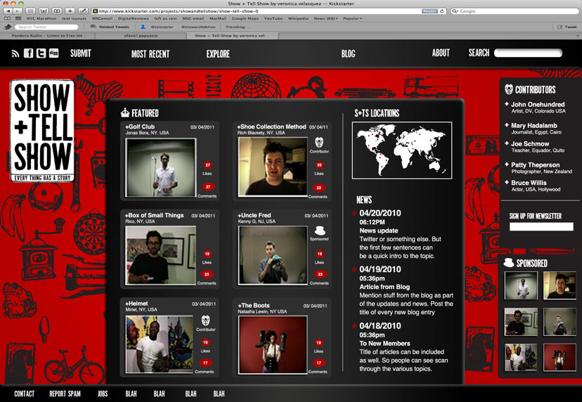
Each video has a thumbnail box that it is fit into upon upload each box has information related to the video like how many comments, likes, the location it was posted from, the date and if the video was made by a featured contributor. We created a visual language that could fit in these boxes but was both easy to interpret and adaptable to the various sections of the site.

Once you entered deeper into the site there were many more features like guest contributors, projects by location and recommended viewing. This meant we had a chance to really push the boundaries with how much content could fit into one page. The boxes really proved to be crucial design element