Branding / Creative Directing
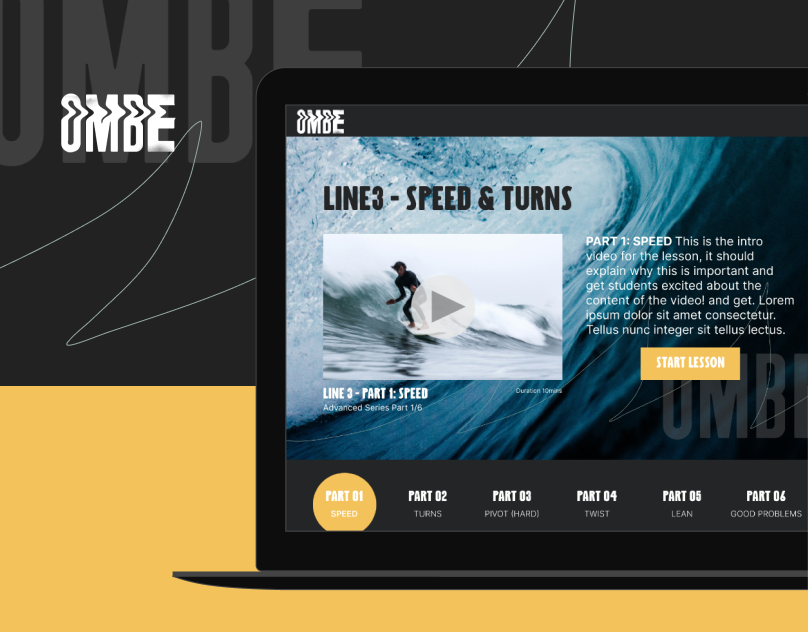
The challenge was to update the look and feel of the Nosara Surf Academy while creating a visual identity that would work with their expanding business. The badge inspired logos make reference to scouts and camp medals. At the same time, the continuety of elements and color pallete help identify them as different aspects of the same business and thus strengthening the sense of brand. Parting from the shape of the original logo, the idea was to create something that would feel like an evolution from the image. At the same time it had to be descriptive of what the new focus of the surf packages would be.
